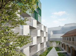
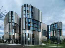
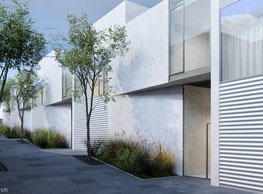
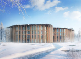
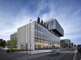
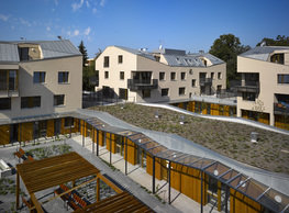
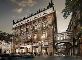
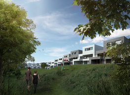
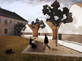
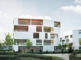
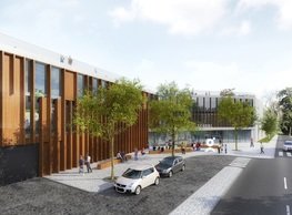
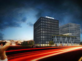
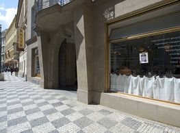
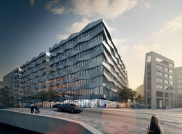
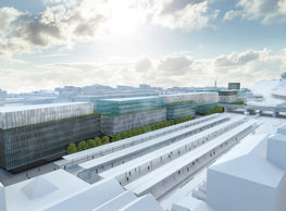
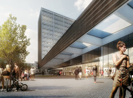
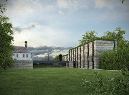
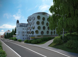
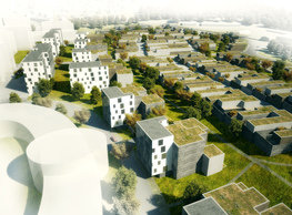
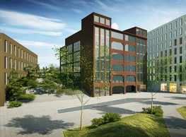
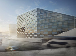
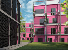
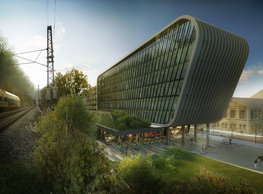
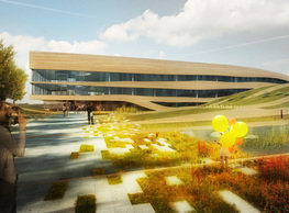
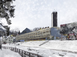
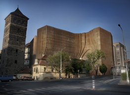
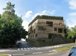
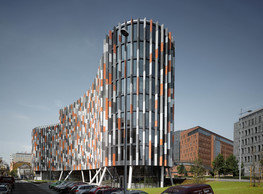
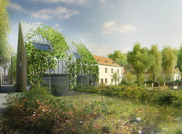
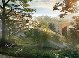
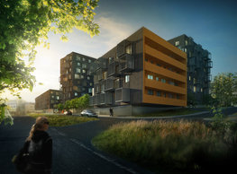
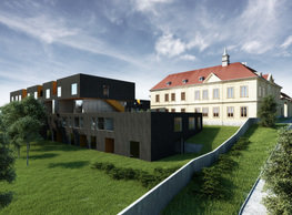
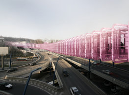
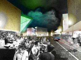
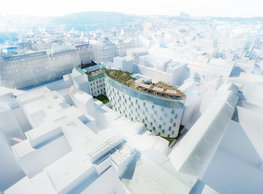
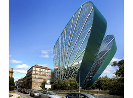
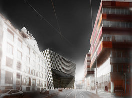
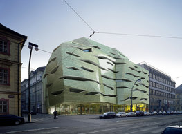
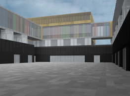
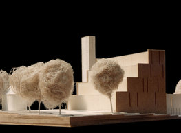
Regarding the breadth of the plan, the following three alternatives of the scope were explored: Development Alternative 1/ Design preserving the Unimex building and the house Nad Museem Development Alternative 2/ Design preserving the house Nad Museem and razing down the Unimex building Development Alternative 3/ Design razing down both buildings – Unimex and Nad Museem The public and main pedestrian entry to the offices is approximately on the level of Rubešova (street) in each alternative. Given the large site, it is logical, that the office program cannot do with just one entrance; the standard is 3-4 entrances with individual lobbies. Those parts of the streetscape adjacent to the busiest pedestrian paths are consistently used for shops and services. Each alternative maintains a particular rate of passage through the internal area, although spaces between the new volumes can work with a specific possibility to close (limited by the daytime) and more intimate to semi-public areas of the streetscape are established that can be used for e.g. a canteen or restaurants. The fundamental principle – again common to each alternative – is perhaps restoring the original compact block structure of the place. It is natural that, based on the parameters of the brief these alternatives differ by the rate of openness – how open or closed the block is; but the thesis that contrary to the current situation – that the city is developed on the outskirts rather than inside – applies to each solution universally. Alternative 1 _ concept ‚ZET/Z‘ Alternative ZET reckons with preserving both buildings ´Nad muzeem´ and ´Unimex´. Regarding the height, the planned building is divided having a two-storied base, a main six-storied body, and an extension on the roof consisting of two stories stepping back. The design acknowledges horizontal division into stories. Where the building follows the street line, stories are allocated exactly above each other and this way form a mass similar to the surrounding development. Only there where the building reaches beyond the border of the land and tilts out into the block stories separate and their stories gap open as a fan. This way arranged to step back floor by floor lets space extend into the internal atrium like a funnel. As a result, the atrium opens upwards more and more and allows more daylight in the block. An exactly different situation is on the opposite side of the building; the volume leaning out establishes a sort of a canopy by which it indicates the position of the main entrance to the building to those who approach it from the National Museum. Due to the pitched terrain, the blocks´ internal space is divided in several elevations ascending to Římská. This arrangement helps to establish a hierarchy of the spaces from the entirely public lower level with the ground floor allowed for retail up to a more intimate level of the upper atrium where the outside part of the canteen and relaxation areas with green for office staff would fit very well. A terraced organisation with levels connected by comfortable staircases where one can sit down provide an attractive connection from Římská to Vinohradská or Rubešova. The area is free and open for those who want to go through (it can be closed at night), and the block development thus does not pose as an undesirable barrier in the area. Key • respecting the existing buildings ´Nad Muzeem´ and ´Unimex´ • meeting the first block regulation following the initial development • improving the quality of the streetscape and the possibility for pedestrians to pass through the area Alternative 2 _ concept ‚DVA DVORY/TWO COURTYARDS‘ In this alternative, we complete the street front on Vinohradská by connecting the gable walls of the existing buildings and closing the block following almost exactly the original footprint from the time the ´Nad Muzeem´ building was erected. We consider razing down the Unimex building and preserving the ´Nad Muzeem´ tenement house. (Despite the fact that it is a good piece of architecture of its time, it was built with the idea that the block would be closed following a different footprint than originally designed; this makes positioning other buildings on the lots difficult). It would be very appropriate if a way to take down the two-storied addition would be found – the same as in the case of both other alternatives. The size of the site motivates to divide the new development into several smaller buildings. In the event of the alternative ´Dva dvory,´ a wing is added on the gap site on Vinohradská. It connects the Czech Radio building and ´Nad Museem´ and continues in the footstep of the former ´Unimex´ establishing the first of the two l-shaped volumes+ the second one develops the street line on Rubešova and Římská. Between them, a levitating glass ´diamond´ by its transparency and reflections dominating both courtyards. key • completion of the original block development in Královské Vinohrady. • division in three different wings • shining sparkling ´diamond´dominates the centre of the development Alternative 3 _ concept ‚KRA/BLOCK‘ A seemingly complicated setting. The plan is perfectly vacated; there is not a single building we would have to reckon with and respect here. But: the scale becomes the problem at this moment. How should we fit such an enormous volume within a block of buildings in Vinohrady where the scale is set by a typically 15-25 meter long front of a tenement house? Analogically to the previous alternatives, the basis of our chosen concept of the volumetric design is respect to the original block regulation of the place and situation established by the site’s morphology and its accessibility. The centrepiece of the volumetry is working with a mass here; the mass will fill the vacated space first and broken in individual blocks the same as once the ancient supercontinent Pangea. Chips – blocks are connected by slender necks; the complex, however, appears more fragmented approximating to the local scale. That is why it is not a problem when a part of the eastern mass ´culminates´ above the level of the other parts in the internal courtyard and establishes a special observation point from where the whole city can be seen. The disintegration of the mass in five blocks effectively provides daylight into the core of the courtyard on the one hand, and through cleavages between blocks also naturally signals possible entrances to the area drawing this ways passers-by in. An archetype of a roughly structured original block levitating above the level of Vinohradská is the visual key to the material and formal design of the building. Cracks or cuts divide this mass into smaller parts. Compared with the rough plastic skin of the outer surface, this way created internal edges are of a clear-cut character. Therefore, while the block’s exterior is more closed, heavier, and plastic due to the broken glass-cement cladding panels, the interior walls are smooth, light, non-structured, with an almost fully glazed surface. Congeniality with the ´stale´ outer envelope is conveyed by only the morphology of the spandrel panels. key • the original block regulation inherent to this location will be preserved • the concept works with breaking the mass into five independent blocks – adapting closer to the scale used in Vinohrady • breaking by light, breaking by passages • the contrast between the rough bark and smooth cut
portfolio
![]()
monastery of st. gabriel
![]()
nová zbrojovka block g
![]()
nad krocínkou a
![]()
nad krocínkou b
![]()
dobřichovice farmstead
![]()
nymburk train station
![]()
stará boleslav primary school
![]()
holečkova 26 residence
![]()
komořany elementary school
![]()
kindergarten jeseniova
![]()
nová elektra residence
![]()
filadelfie bldg. – the new reception
![]()
písnice elementary school
![]()
bytové domy vítězná/újezd
![]()
afi vokovice
![]()
showroom elite bath/bulthaup sk
![]()
port 7
![]()
main point pankrác
![]()
oktáva houses
![]()
lesy čr headquarters
![]()
royal tomb
![]()
the blox
![]()
dob centre in dobřichovice
![]()
contemporary glass muzeum
![]()
pod hády brno
![]()
elite bath showroom karlín
![]()
communal flats in dolní břežany
![]()
šantovka residence
![]()
open gate II
![]()
ružinov office building
![]()
dlouhá palace
![]()
vinohradská 8
![]()
masarykovo railway station
![]()
retail and office development
![]()
jindřišská 16
![]()
jungmannova 15
![]()
regina hradec králové
![]()
chateau dolní břežany
![]()
the metropole hotel in mariánské lázně (marienbad)
![]()
waltrovka
![]()
square mechanica
![]()
porto mercandini
![]()
plzeňská 18
![]()
vrchlického residence
![]()
karlín railway
![]()
science research centre
![]()
sněžka apartment house
![]()
novomlýnská brána
![]()
jeremenkova residence
![]()
main point karlin
![]()
flat b3 prague
![]()
štěpánská 47
![]()
tenement house with a gym
![]()
švédská residence
![]()
hendlův dvůr
![]()
klamovka residential complex
![]()
botanica vidoule phase 6
![]()
footbridge in bb centre
![]()
perníkářka manor
![]()
municipal interventions prague 2010
![]()
černá louka ostrava
![]()
evropa hotel
![]()
bb centrum filadelfie
![]()
family houses in radotín
![]()
cherubín II
![]()
fc bohemians praha 1905
![]()
ostrolovský újezd chateau
![]()
zlín cultural centre
![]()
znojemská hospice
![]()
pilsner urquell
![]()
st. wenceslas exposition
![]()
institute of noblewomen
![]()
karlov office building
![]()
cherub I
![]()
pařížská 9
![]()
jinonice villa park
![]()
petynka hotel
![]()
sanopz residential complex
![]()
viktoria center pankrác
![]()
hotel crystal palace
![]()
invalidovna offices
![]()
performing arts center seoul
![]()
boscolo carlo IV hotel
![]()
toner recycling company building
![]()
the story of prague castle
![]()
umprum in prague-ďáblice
![]()
mrázovka apartment villa
![]()
school gym in prague-troja
![]()
roma hotel
![]()
euro palace
![]()
ten centuries of architecture
![]()
villa třešňovka
![]()
velká skála
![]()
sternberg palace prague castle
![]()
st. nicholas church in čečovice
![]()
olga and václav havel's villa
![]()
tierpark langenberg
![]()
a church in neratovice
![]()
school centre interlaken
![]()
forestry school in lyss
![]()
villa dobeška
![]()
tuscany in maps


