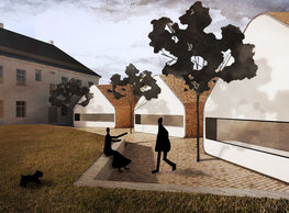
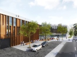
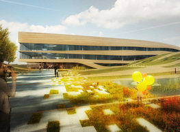
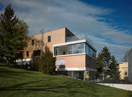
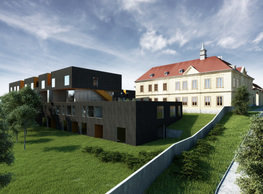
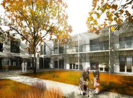
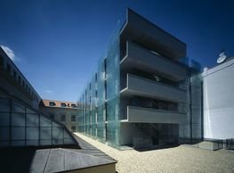
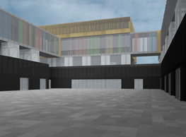
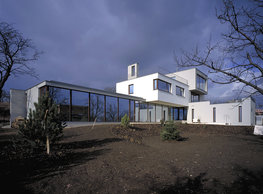
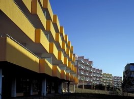
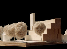
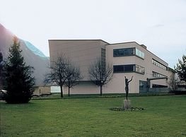
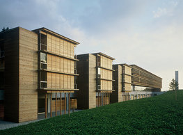
The concept of the analogy of a human hand grasping the mass of the original school building in its five fingers is the basis of the material design. The five fingers - each with a slightly different functional use - leave the space of the old school so that it is clear at a glance what is an extension and what is the historical essence of the complex - the original trunk. Therefore, the concept of the additions' facades consistently designed as a unified substance is part of this dichotomous hierarchy. The individual fingers differ only in proportion, not in the type of cladding. On the east side, a blank facade ties the mass of the extensions to the very boundary of the school grounds. It is analogous to the behaviour of the adjacent building on the adjoining property; it is a principle found in many places in the original native village. The main access to the building is from the school's front on the south side. Our volumetric design of the additions emphasises the dominance of the original school building; therefore, the new buildings are shifted by a half storey relative to the existing school floors. Despite all this, almost the entire floor area of the school is accessed for wheelchair users. The spacious central lobby is the focal space where all levels meet and balance. It is the epicentre of the whole school. This place is where everyone - pupils, teachers, visitors, parents - can meet, gather, hold an informal event or performance. The abundance of natural daylight also brought in through the skylight invites people to relax. Entering the communications lobby, even a first-time visitor should be able to easily "read" the entire layout of the school's volumes and safely find the right way. The principle of the arrangement of the additions' masses is derived from the parallel with the human hand. However, the notion of the external materialisation of the structure and surfaces is based on a concept meeting with the human hand to a certain extent, although rather metaphysically – that is, on the analogy of a hand fan of a colour card. The visual inspiration for the materials and shape of the building is, in fact, the metaphor of a colour card. What interests us here is the principle of the dense horizontal plying of its leaves, the tiny overlaps, the occasional revelation of colour even on the outside - strictly on horizontal surfaces. At first glance, the added masses are made of the same neutral grey dough as the old school's parent building. Inside, however, they revel in all the colours of the world. Each horizontal surface connected to the building is a carrier of colour. The colours chosen for each finger are always in a trio of tones from one family of the colour spectrum. Thus, one finger is yellow, the next one is blue, and another is green. Translated into constructing reality, it generates a simple rule - horizontal surfaces such as floors, ceilings, windowsills = always full colour. Vertical surfaces - walls, fillings = always neutral grey.
![]()
monastery of st. gabriel
![]()
nová zbrojovka block g
![]()
nad krocínkou a
![]()
nad krocínkou b
![]()
dobřichovice farmstead
![]()
nymburk train station
![]()
stará boleslav primary school
![]()
holečkova 26 residence
![]()
komořany elementary school
![]()
kindergarten jeseniova
![]()
nová elektra residence
![]()
filadelfie bldg. – the new reception
![]()
písnice elementary school
![]()
bytové domy vítězná/újezd
![]()
afi vokovice
![]()
showroom elite bath/bulthaup sk
![]()
port 7
![]()
main point pankrác
![]()
oktáva houses
![]()
lesy čr headquarters
![]()
royal tomb
![]()
the blox
![]()
dob centre in dobřichovice
![]()
contemporary glass muzeum
![]()
pod hády brno
![]()
elite bath showroom karlín
![]()
communal flats in dolní břežany
![]()
šantovka residence
![]()
open gate II
![]()
ružinov office building
![]()
dlouhá palace
![]()
vinohradská 8
![]()
masarykovo railway station
![]()
retail and office development
![]()
jindřišská 16
![]()
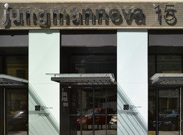
jungmannova 15
![]()
regina hradec králové
![]()
chateau dolní břežany
![]()
the metropole hotel in mariánské lázně (marienbad)
![]()
waltrovka
![]()
square mechanica
![]()
porto mercandini
![]()
plzeňská 18
![]()
vrchlického residence
![]()
karlín railway
![]()
science research centre
![]()
sněžka apartment house
![]()
novomlýnská brána
![]()
jeremenkova residence
![]()
main point karlin
![]()
flat b3 prague
![]()
štěpánská 47
![]()
tenement house with a gym
![]()
švédská residence
![]()
hendlův dvůr
![]()
klamovka residential complex
![]()
botanica vidoule phase 6
![]()
footbridge in bb centre
![]()
perníkářka manor
![]()
municipal interventions prague 2010
![]()
černá louka ostrava
![]()
evropa hotel
![]()
bb centrum filadelfie
![]()
family houses in radotín
![]()
cherubín II
![]()
fc bohemians praha 1905
![]()
ostrolovský újezd chateau
![]()
zlín cultural centre
![]()
znojemská hospice
![]()
pilsner urquell
![]()
st. wenceslas exposition
![]()
institute of noblewomen
![]()
karlov office building
![]()
cherub I
![]()
pařížská 9
![]()
jinonice villa park
![]()
petynka hotel
![]()
sanopz residential complex
![]()
viktoria center pankrác
![]()
hotel crystal palace
![]()
invalidovna offices
![]()
performing arts center seoul
![]()
boscolo carlo IV hotel
![]()
toner recycling company building
![]()
the story of prague castle
![]()
umprum in prague-ďáblice
![]()
mrázovka apartment villa
![]()
school gym in prague-troja
![]()
roma hotel
![]()
euro palace
![]()
ten centuries of architecture
![]()
villa třešňovka
![]()
velká skála
![]()
sternberg palace prague castle
![]()
st. nicholas church in čečovice
![]()
olga and václav havel's villa
![]()
tierpark langenberg
![]()
a church in neratovice
![]()
school centre interlaken
![]()
forestry school in lyss
![]()
villa dobeška
![]()
tuscany in maps


