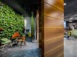
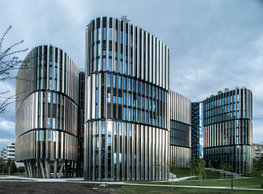
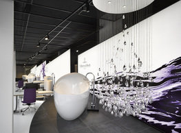
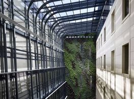
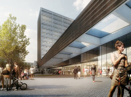
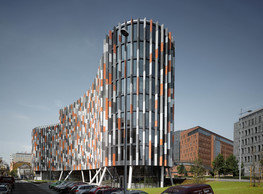
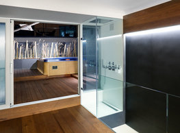
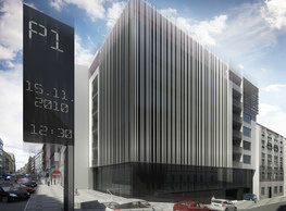
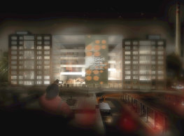
The entrance lobby's old scheme divided it into the public section where we situated the entrance into the shopping passage accessed from the adjacent park and the reception lobby itself with the main entrance from Želetavská Street. The reason for this arrangement was to improve the building's safety. Separating the public's unrestricted access from the residential – controlled access to the upper floors – was standard for this type of buildings shortly after 9/11 in New York. Over the years of Philadelphia's operation, however, it has become increasingly clear that this arrangement decreases user comfort, and safety could be ensured due to better technologies even without this operational separation. That is why, when our office was invited to design the new lobby, the unification of both sections into one open and free space was by all means principal to us. The idea of joining both, so far divided sections, enlarging the lobby and making it airier determines all other modifications and alterations designed for this refurbishment and modernization. The reception counter's central object was relocated to the front of this space, clinging to the lift bank. The counter's dimensions, including its back-office facilities, was optimized. Now, it faces the incoming visitors. Its shape does not block two passageways around a glass bank of two lifts anymore that connected the previously separated segments of the building entrance. The former minimalistic or even technicist interior design was replaced by somewhat playful, optically light materials and areas. The old stone and purist plaster were replaced by polished stainless steel making the wrapped structures slimmer or even invisible, and by vertical gardens introducing nature into the new interior. Areas allocated for informal meetings or short breaks are furnished to provide some privacy and neatness even in such a formal space as a vast office building reception. And there are also two interactive areas here. The first one next to the entrance from Želetavská Street and the second behind the reception counter. Sets of sophisticated projectors project up-to-date information on them or can create variable pieces of projection mapping art. The last substantial change initiated by the refurbishment was designing a new portal to the building from the park in Baarova Street. The two old dull entrances (one for the offices, the other for the retail areas) were replaced by just one positioned into the visual centre, between two wings. So, the building can be entered through an amply dimensioned entrance exactly opposite the reception counter.
portfolio
![]()
monastery of st. gabriel
![]()
nová zbrojovka block g
![]()
nad krocínkou a
![]()
nad krocínkou b
![]()
dobřichovice farmstead
![]()
nymburk train station
![]()
stará boleslav primary school
![]()
holečkova 26 residence
![]()
komořany elementary school
![]()
kindergarten jeseniova
![]()
nová elektra residence
![]()
filadelfie bldg. – the new reception
![]()
písnice elementary school
![]()
bytové domy vítězná/újezd
![]()
afi vokovice
![]()
showroom elite bath/bulthaup sk
![]()
port 7
![]()
main point pankrác
![]()
oktáva houses
![]()
lesy čr headquarters
![]()
royal tomb
![]()
the blox
![]()
dob centre in dobřichovice
![]()
contemporary glass muzeum
![]()
pod hády brno
![]()
elite bath showroom karlín
![]()
communal flats in dolní břežany
![]()
šantovka residence
![]()
open gate II
![]()
ružinov office building
![]()
dlouhá palace
![]()
vinohradská 8
![]()
masarykovo railway station
![]()
retail and office development
![]()
jindřišská 16
![]()
jungmannova 15
![]()
regina hradec králové
![]()
chateau dolní břežany
![]()
the metropole hotel in mariánské lázně (marienbad)
![]()
waltrovka
![]()
square mechanica
![]()
porto mercandini
![]()
plzeňská 18
![]()
vrchlického residence
![]()
karlín railway
![]()
science research centre
![]()
sněžka apartment house
![]()
novomlýnská brána
![]()
jeremenkova residence
![]()
main point karlin
![]()
flat b3 prague
![]()
štěpánská 47
![]()
tenement house with a gym
![]()
švédská residence
![]()
hendlův dvůr
![]()
klamovka residential complex
![]()
botanica vidoule phase 6
![]()
footbridge in bb centre
![]()
perníkářka manor
![]()
municipal interventions prague 2010
![]()
černá louka ostrava
![]()
evropa hotel
![]()
bb centrum filadelfie
![]()
family houses in radotín
![]()
cherubín II
![]()
fc bohemians praha 1905
![]()
ostrolovský újezd chateau
![]()
zlín cultural centre
![]()
znojemská hospice
![]()
pilsner urquell
![]()
st. wenceslas exposition
![]()
institute of noblewomen
![]()
karlov office building
![]()
cherub I
![]()
pařížská 9
![]()
jinonice villa park
![]()
petynka hotel
![]()
sanopz residential complex
![]()
viktoria center pankrác
![]()
hotel crystal palace
![]()
invalidovna offices
![]()
performing arts center seoul
![]()
boscolo carlo IV hotel
![]()
toner recycling company building
![]()
the story of prague castle
![]()
umprum in prague-ďáblice
![]()
mrázovka apartment villa
![]()
school gym in prague-troja
![]()
roma hotel
![]()
euro palace
![]()
ten centuries of architecture
![]()
villa třešňovka
![]()
velká skála
![]()
sternberg palace prague castle
![]()
st. nicholas church in čečovice
![]()
olga and václav havel's villa
![]()
tierpark langenberg
![]()
a church in neratovice
![]()
school centre interlaken
![]()
forestry school in lyss
![]()
villa dobeška
![]()
tuscany in maps


