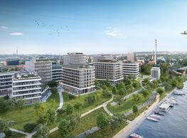
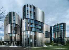
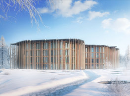
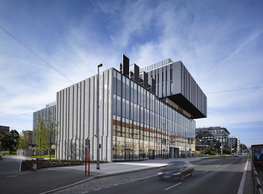
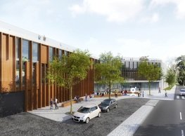
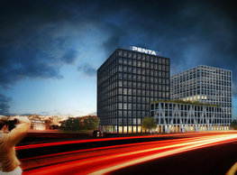
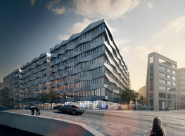
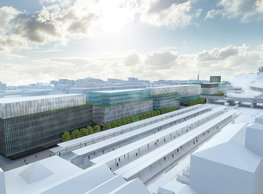
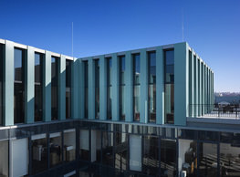
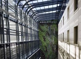
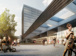
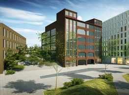
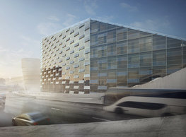
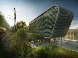
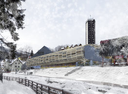
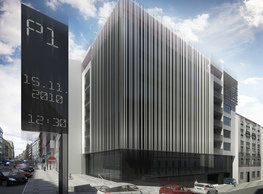
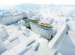
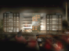
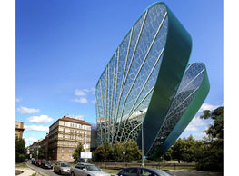
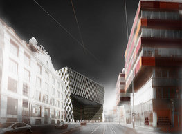
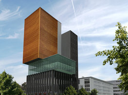
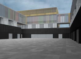
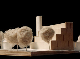
No matter how well the ´slab-like´ flat building of the famous Černigov hotel is established in the local setting, some urbanistic-compositional mistakes must be pointed out. Firstly, positioning the hotel at the square omitted the initially considered smaller scale of the area in front of the railway station. This fact relates to the time the hotel was built when the compact block-type city was not in anymore and ´no public space was large enough´. The hotel is located too far away from the railway station today, and the square consequently disintegrates. Černigov stands within a block-type town, but by its configuration (a large raised pedestal surrounded by a residual green no man´s land) it stands as a clear solitary structure. The basis of our selected concept of the material design is respecting the first local regulation and the situation introduced by the dominant building of the railway station. Thus, the first step in our principal was to rehabilitate the footprint of the original block. The key to a dignified opposing to the railway station is setting the front edge of the new building as close to the railway station′ s east front as possible. That is why we try to get our block slightly longer than 100 meters as close to the west border of the developable land as possible. To achieve the maximum in this respect, referring to the irregular course of the west side of the developable land, and due to the completed and irrevocable modifications of the streetscape, we had to remove one part of the block′s volume. A cantilevered ´urban pergola´ of generous dimensions was established this way. It can introduce a unique semi-covered public space with a clear height starting at 11 meters to Hradec Králové. This specific arcade lets daylight in feeding the existing trees while shielding hotel guests and passers-by from effects of adverse weather. Semantically (and not just due to its pitch) the arcade functions as a hypertrophied awning marking the hotel entrance. Nevertheless, the point of gravity and the genuine counterweight to the railway station becomes the very tall volume with guestrooms at the north-west corner of the new block we insert in here. Conceptually, this is a sort of a vertical ´recess´ of the block. The slab containing the guestrooms reaches the same height as the Černigov hotel; it just works with different longitudinal proportions and, above all, rotates the volume by its shorter side perpendicularly to the railway station building. Due to the ´heavy mass´ of the slab containing guestrooms, our block broke along the north-south longitudinal axis and by its seam emphasised the cut between the functions – hotel/offices. We underline the idea of a broken up spatial lace reaching to the sky by the physical character of the envelope. In this particular case, we use the principle of cutting through and loosening the formerly virtually compact mass extruded out from the site or the block if you like. Structuring and hierarchization of surfaces work with distinguishing the outer perimeter skin, the cutting edges, and the inserted grating making the whole structure lighter and fixing the shape of a compact block at those places where we locate the clearing cuts. The cantilevered awning covers all the principal entrances to the hotel (except for the service ones). The main entrance to the hotel lobby is linked to the porte-cochere from the square, and it is sufficiently close to the vertical circulation areas in the hotel part. Catering services, retail units and the entrance to the congress areas are on the hotel’s ground floor. The wellness facilities are connected to the roof garden. All guestrooms are contained in the main slab-shaped volume. The most luxury part is logically on the highest level – the hotel thus provides broad views to the city and its environs. A sky bar is located on the top floor at the east side facing the centre; the sky bar is accessed from a separate staircase via the lobby or directly from the outside. The roof above the horizontal part of hotel facilities plays an important role; regarding the qualities of views from guestrooms, it is designed as an intensive green and using the cuts through the atriums greenery penetrates down to the 1st floor. The office part accessed from the south (or from the north, if necessary) is ´locked onto´ the backbone north-south corridor; this arrangement makes access and construction phasing easier. This part is serviced by two main vertical circulation cores. The layout has plenty of daylight thanks to the straight courtyards cut through; greenery on the bottom of this way established atriums creates a pleasant microclimate. A rentable area for retail and services is allocated on the ground floor of the southernmost wing of the office building facing the main street. Our aspiration was, aside from the need to satisfy the programme and investor′s requirements, that Regina would bring many unusual urban spaces to Hradec Králové and stately complete the generous space of Riegrovo náměstí. key • preserving the icon as a stately counterweight to the railway station • respecting the block / original regulation • better defining of Riegrovo náměstí • unique semi-covered urban space • roof as a green garden
portfolio
![]()
monastery of st. gabriel
![]()
nová zbrojovka block g
![]()
nad krocínkou a
![]()
nad krocínkou b
![]()
dobřichovice farmstead
![]()
nymburk train station
![]()
stará boleslav primary school
![]()
holečkova 26 residence
![]()
komořany elementary school
![]()
kindergarten jeseniova
![]()
nová elektra residence
![]()
filadelfie bldg. – the new reception
![]()
písnice elementary school
![]()
bytové domy vítězná/újezd
![]()
afi vokovice
![]()
showroom elite bath/bulthaup sk
![]()
port 7
![]()
main point pankrác
![]()
oktáva houses
![]()
lesy čr headquarters
![]()
royal tomb
![]()
the blox
![]()
dob centre in dobřichovice
![]()
contemporary glass muzeum
![]()
pod hády brno
![]()
elite bath showroom karlín
![]()
communal flats in dolní břežany
![]()
šantovka residence
![]()
open gate II
![]()
ružinov office building
![]()
dlouhá palace
![]()
vinohradská 8
![]()
masarykovo railway station
![]()
retail and office development
![]()
jindřišská 16
![]()
jungmannova 15
![]()
regina hradec králové
![]()
chateau dolní břežany
![]()
the metropole hotel in mariánské lázně (marienbad)
![]()
waltrovka
![]()
square mechanica
![]()
porto mercandini
![]()
plzeňská 18
![]()
vrchlického residence
![]()
karlín railway
![]()
science research centre
![]()
sněžka apartment house
![]()
novomlýnská brána
![]()
jeremenkova residence
![]()
main point karlin
![]()
flat b3 prague
![]()
štěpánská 47
![]()
tenement house with a gym
![]()
švédská residence
![]()
hendlův dvůr
![]()
klamovka residential complex
![]()
botanica vidoule phase 6
![]()
footbridge in bb centre
![]()
perníkářka manor
![]()
municipal interventions prague 2010
![]()
černá louka ostrava
![]()
evropa hotel
![]()
bb centrum filadelfie
![]()
family houses in radotín
![]()
cherubín II
![]()
fc bohemians praha 1905
![]()
ostrolovský újezd chateau
![]()
zlín cultural centre
![]()
znojemská hospice
![]()
pilsner urquell
![]()
st. wenceslas exposition
![]()
institute of noblewomen
![]()
karlov office building
![]()
cherub I
![]()
pařížská 9
![]()
jinonice villa park
![]()
petynka hotel
![]()
sanopz residential complex
![]()
viktoria center pankrác
![]()
hotel crystal palace
![]()
invalidovna offices
![]()
performing arts center seoul
![]()
boscolo carlo IV hotel
![]()
toner recycling company building
![]()
the story of prague castle
![]()
umprum in prague-ďáblice
![]()
mrázovka apartment villa
![]()
school gym in prague-troja
![]()
roma hotel
![]()
euro palace
![]()
ten centuries of architecture
![]()
villa třešňovka
![]()
velká skála
![]()
sternberg palace prague castle
![]()
st. nicholas church in čečovice
![]()
olga and václav havel's villa
![]()
tierpark langenberg
![]()
a church in neratovice
![]()
school centre interlaken
![]()
forestry school in lyss
![]()
villa dobeška
![]()
tuscany in maps


