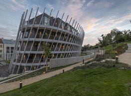
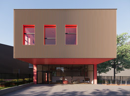
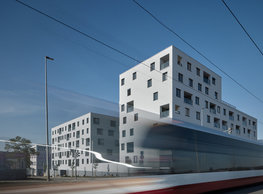
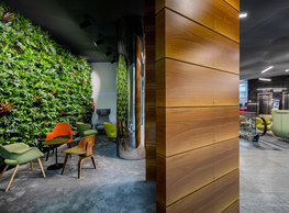
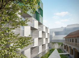
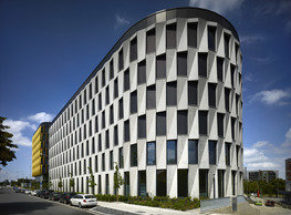
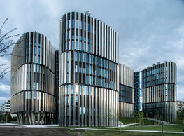
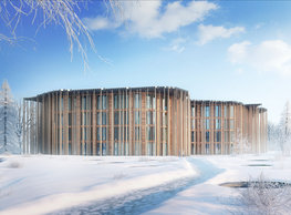
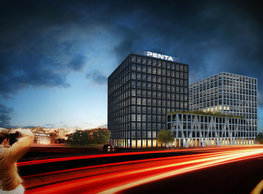
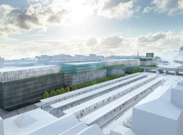
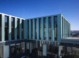
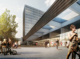
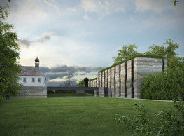
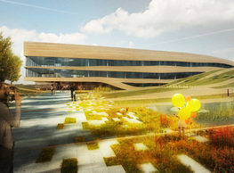
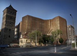
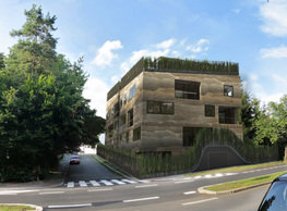
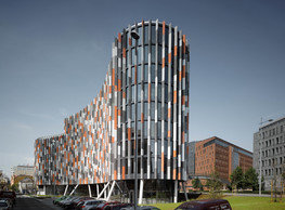
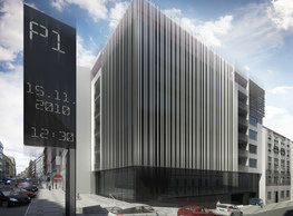
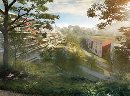
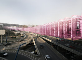
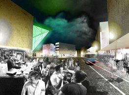
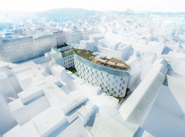
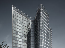
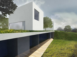
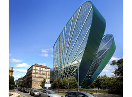
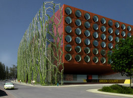
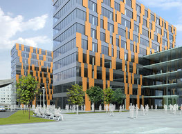
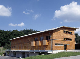
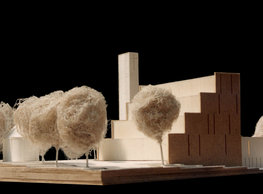
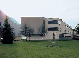
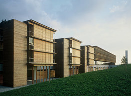
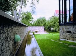
The volumetric design builds on the concept of an analogy with a commercial forest with an office building inserted into its regularly irregular structure. Massive trunks establish the spatial equivalent of a pattern all of us do know so well. Trunks are the vertical frame of the superstructure at the same time. This way, they are a simple ´product placement´ of the most important commodity the company trades. A building hidden in the ´forest´ can cut any shape in it in fact – it seems logical to us that it is as irregular as a forest in the country can be. The light and sunshine are filtered through branches – symbolised as a lightweight honeycomb pergola. When we contemplated about a proper definition of this way re-told forest, the abstracted outline of the territory of the Czech Republic crossed out minds. A hint; a semantic superstructure of the main concept unambiguously based on the idea of labouring with massive trunks as an analogy with a forest. In fact, we were surprised how organically this outline matched the shape of the developable site – even more so, we could meet the correct orientation to cardinal points. Everything not needing much daylight is hidden underground – into a concrete base. The sloping ground is used to bring daylight into the ancillary non-office rooms through a perforated exposed outer wall from the north. The concept of landscaping, surfacing, and green areas near the building closely relates to the visual concept. The entering into the building should be a pleasing experience. The sloping terrain and the pedestrian zone allows to work with (running and still) water, combine slightly different characters of the greenery on each side, prompts to install 3D pieces of art. The geometrically precisely modelled slopes are sliced through by no less exact cleavages of the entries into the car park. A widened throat with benches around a small water pool is in front of the entrance. An iceberg from which a forest grows up is fixed in the mound exposed only to the south where the entrance is. It is much better legible on the north side. Platforms cut into the slope are used as front gardens to the canteen, wellness, and facility manager’s flat here. The border between the building and the forest park is very tiny, naturally erased by growing trees. The forest is connected to the building by a clay macadam path leading on the roof of the parking via a staircase to the vestibule of the entrance lobby. The accommodation section of the building is similarly accessed from the exterior.
![]()
monastery of st. gabriel
![]()
nová zbrojovka block g
![]()
nad krocínkou a
![]()
nad krocínkou b
![]()
dobřichovice farmstead
![]()
nymburk train station
![]()
stará boleslav primary school
![]()
holečkova 26 residence
![]()
komořany elementary school
![]()
kindergarten jeseniova
![]()
nová elektra residence
![]()
filadelfie bldg. – the new reception
![]()
písnice elementary school
![]()
bytové domy vítězná/újezd
![]()
afi vokovice
![]()
showroom elite bath/bulthaup sk
![]()
port 7
![]()
main point pankrác
![]()
oktáva houses
![]()
lesy čr headquarters
![]()
royal tomb
![]()
the blox
![]()
dob centre in dobřichovice
![]()
contemporary glass muzeum
![]()
pod hády brno
![]()
elite bath showroom karlín
![]()
communal flats in dolní břežany
![]()
šantovka residence
![]()
open gate II
![]()
ružinov office building
![]()
dlouhá palace
![]()
vinohradská 8
![]()
masarykovo railway station
![]()
retail and office development
![]()
jindřišská 16
![]()
jungmannova 15
![]()
regina hradec králové
![]()
chateau dolní břežany
![]()
the metropole hotel in mariánské lázně (marienbad)
![]()
waltrovka
![]()
square mechanica
![]()
porto mercandini
![]()
plzeňská 18
![]()
vrchlického residence
![]()
karlín railway
![]()
science research centre
![]()
sněžka apartment house
![]()
novomlýnská brána
![]()
jeremenkova residence
![]()
main point karlin
![]()
flat b3 prague
![]()
štěpánská 47
![]()
tenement house with a gym
![]()
švédská residence
![]()
hendlův dvůr
![]()
klamovka residential complex
![]()
botanica vidoule phase 6
![]()
footbridge in bb centre
![]()
perníkářka manor
![]()
municipal interventions prague 2010
![]()
černá louka ostrava
![]()
evropa hotel
![]()
bb centrum filadelfie
![]()
family houses in radotín
![]()
cherubín II
![]()
fc bohemians praha 1905
![]()
ostrolovský újezd chateau
![]()
zlín cultural centre
![]()
znojemská hospice
![]()
pilsner urquell
![]()
st. wenceslas exposition
![]()
institute of noblewomen
![]()
karlov office building
![]()
cherub I
![]()
pařížská 9
![]()
jinonice villa park
![]()
petynka hotel
![]()
sanopz residential complex
![]()
viktoria center pankrác
![]()
hotel crystal palace
![]()
invalidovna offices
![]()
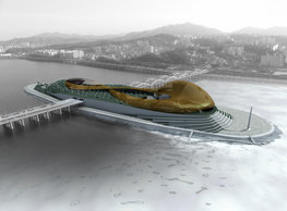
performing arts center seoul
![]()
boscolo carlo IV hotel
![]()
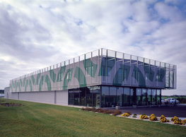
toner recycling company building
![]()
the story of prague castle
![]()
umprum in prague-ďáblice
![]()
mrázovka apartment villa
![]()
school gym in prague-troja
![]()
roma hotel
![]()
euro palace
![]()
ten centuries of architecture
![]()
villa třešňovka
![]()
velká skála
![]()
sternberg palace prague castle
![]()
st. nicholas church in čečovice
![]()
olga and václav havel's villa
![]()
tierpark langenberg
![]()
a church in neratovice
![]()
school centre interlaken
![]()
forestry school in lyss
![]()
villa dobeška
![]()
tuscany in maps


