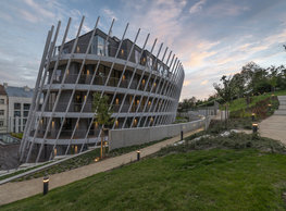
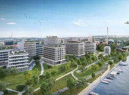
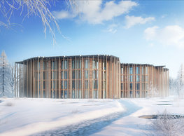
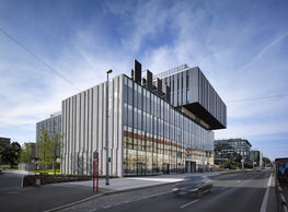
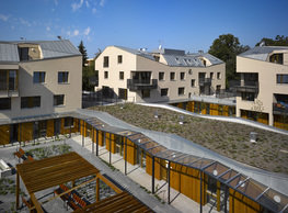
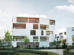
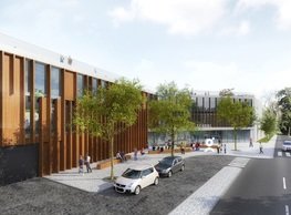
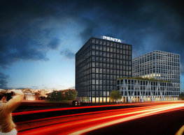
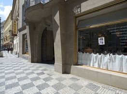
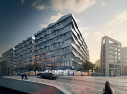
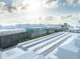
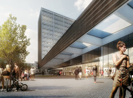
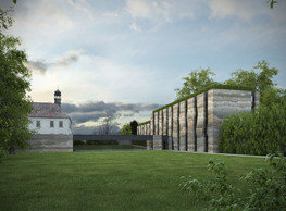
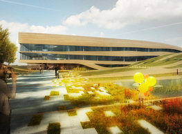
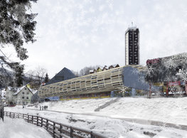
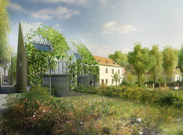
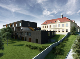
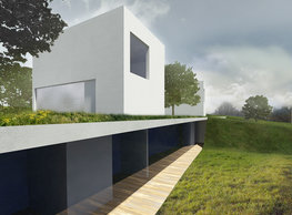
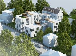
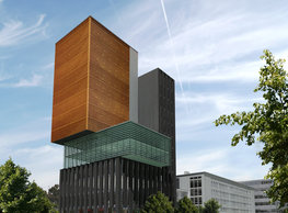
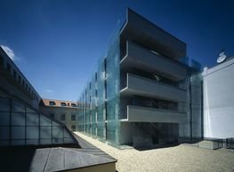
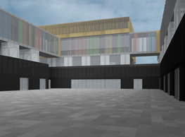
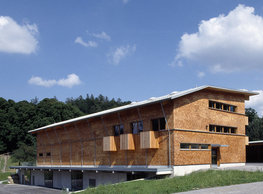
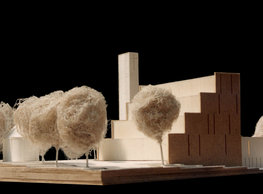
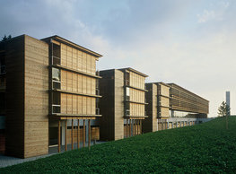
We consider the distinctly horizontal and relatively low mass of the existing shopping centre as positive. That is why we are ever since the beginning of our work on the project that this quality should be preserved in the new volumetric design. We propose adding two more stories above the shopping centre on the south side and three on the north side. We deal with the layout – which is too deep for living – by making it even deeper. Though ironically, this arrangement will allow grouping the addition in two parallel rows of flats oriented to the south clustered around a grand-scale internal atrium – a common terrace. The addition is optically clad by a unifying envelope of timber boards. We can say that since the character of the mass will remain unchanged after the conversion and because we do not intend to increase the number of stories in the new building, the effect of the original volume will not change from the perspective of a passer-by. The open atrium is the centre of the layout of the top residential floors. The addition is allocated for smaller units that can be efficiently serviced by a horizontal corridor. Despite its length, this corridor can be a pleasing environment because it is perfectly daylighted. Logically, for we do not increase the current volume too much, the remaining necessary capacity must be located somewhere. That is why a separate extension is added. It is proposed on the west side of the site instead of the current dead-end service road. Contrary to the added volume, we design a high, slender volume here contrasting with the long ´log´. It is shaped as a simple quadratic form transformed by breaking and cutting to establish a logical entry into the compound and so that the new building would block as little sunlight to the addition built on the original centre as possible. A formation with a ´ridged roof´ is established this way – traditionally, the ridge is parallel to the contour line: a building – monolith that does not distinguish between a wall and a roof – simply a ´rock´. The addition is intentionally higher than the ´log´; the buildings are in a sort of juxtaposition. The original morphology of the slope is ´restored´ by covering the actual cut (supply yard) by a green roof from the north. For the addition, we work with a transposed metaphor of a compact mass – a log that sort of ´landed´ on the pedestal formed by the original renovated ground-floor building. That is also why we selected wood as an adequate natural element for the outer cladding material. Using timber logs (ca 10 cm in diameter) allows working with variable density of this covering grating (it almost disappears above the common terrace, for example); yet the unifying function of this layer is vital as soon as you realise that the roof is the fifth facade in our case. This way conceived element establishes a soffit, a balustrade, or a pergola or a shading jalousie here and there, depending on the position along the envelope. This approach strictly distinguishes between the principle of a rougher light surface skin and the contrast internal mass (apartments) which is smooth and dark on the surface of the cut. The crucial element of materialising is some complementarity of the concept of the new building and the extension. While the extension has wood on the surface and the dark surface inside, the new building has it the other way around. It is covered by a unified dark material forming the surface of the wall and the roof (e.g. Eternit (fibre-cement) shingles, fine sheet metal, and similar), white the cuts in this mass in the form of recessed loggias are clad in wood.
portfolio
![]()
monastery of st. gabriel
![]()
nová zbrojovka block g
![]()
nad krocínkou a
![]()
nad krocínkou b
![]()
dobřichovice farmstead
![]()
nymburk train station
![]()
stará boleslav primary school
![]()
holečkova 26 residence
![]()
komořany elementary school
![]()
kindergarten jeseniova
![]()
nová elektra residence
![]()
filadelfie bldg. – the new reception
![]()
písnice elementary school
![]()
bytové domy vítězná/újezd
![]()
afi vokovice
![]()
showroom elite bath/bulthaup sk
![]()
port 7
![]()
main point pankrác
![]()
oktáva houses
![]()
lesy čr headquarters
![]()
royal tomb
![]()
the blox
![]()
dob centre in dobřichovice
![]()
contemporary glass muzeum
![]()
pod hády brno
![]()
elite bath showroom karlín
![]()
communal flats in dolní břežany
![]()
šantovka residence
![]()
open gate II
![]()
ružinov office building
![]()
dlouhá palace
![]()
vinohradská 8
![]()
masarykovo railway station
![]()
retail and office development
![]()
jindřišská 16
![]()
jungmannova 15
![]()
regina hradec králové
![]()
chateau dolní břežany
![]()
the metropole hotel in mariánské lázně (marienbad)
![]()
waltrovka
![]()
square mechanica
![]()
porto mercandini
![]()
plzeňská 18
![]()
vrchlického residence
![]()
karlín railway
![]()
science research centre
![]()
sněžka apartment house
![]()
novomlýnská brána
![]()
jeremenkova residence
![]()
main point karlin
![]()
flat b3 prague
![]()
štěpánská 47
![]()
tenement house with a gym
![]()
švédská residence
![]()
hendlův dvůr
![]()
klamovka residential complex
![]()
botanica vidoule phase 6
![]()
footbridge in bb centre
![]()
perníkářka manor
![]()
municipal interventions prague 2010
![]()
černá louka ostrava
![]()
evropa hotel
![]()
bb centrum filadelfie
![]()
family houses in radotín
![]()
cherubín II
![]()
fc bohemians praha 1905
![]()
ostrolovský újezd chateau
![]()
zlín cultural centre
![]()
znojemská hospice
![]()
pilsner urquell
![]()
st. wenceslas exposition
![]()
institute of noblewomen
![]()
karlov office building
![]()
cherub I
![]()
pařížská 9
![]()
jinonice villa park
![]()
petynka hotel
![]()
sanopz residential complex
![]()
viktoria center pankrác
![]()
hotel crystal palace
![]()
invalidovna offices
![]()
performing arts center seoul
![]()
boscolo carlo IV hotel
![]()
toner recycling company building
![]()
the story of prague castle
![]()
umprum in prague-ďáblice
![]()
mrázovka apartment villa
![]()
school gym in prague-troja
![]()
roma hotel
![]()
euro palace
![]()
ten centuries of architecture
![]()
villa třešňovka
![]()
velká skála
![]()
sternberg palace prague castle
![]()
st. nicholas church in čečovice
![]()
olga and václav havel's villa
![]()
tierpark langenberg
![]()
a church in neratovice
![]()
school centre interlaken
![]()
forestry school in lyss
![]()
villa dobeška
![]()
tuscany in maps


