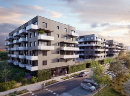
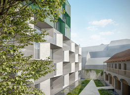
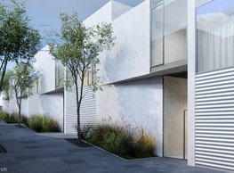
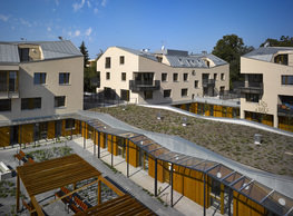
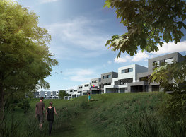
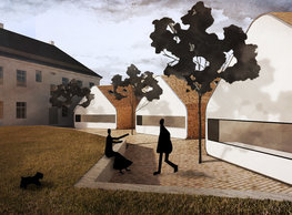
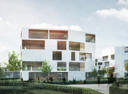
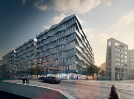
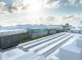
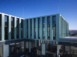
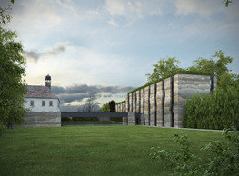
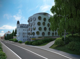
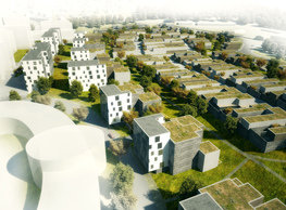
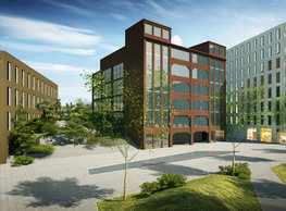
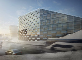
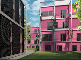
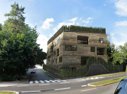
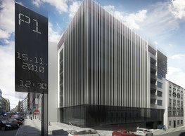
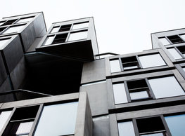
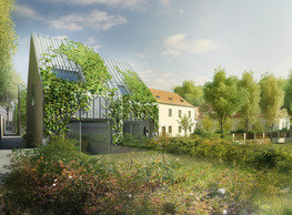
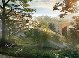
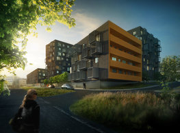
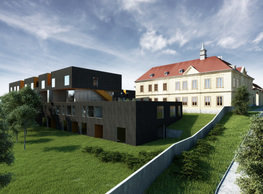
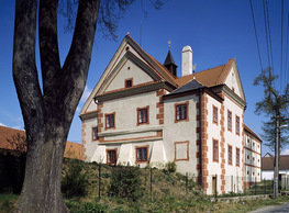
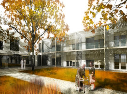
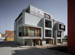
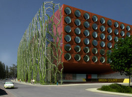
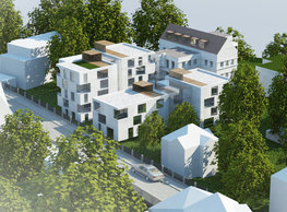
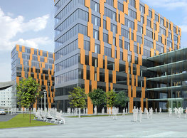
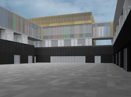
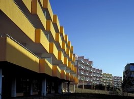
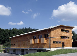
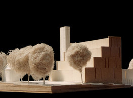
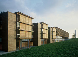
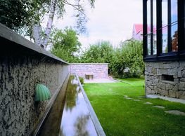
The historic building consist of three blocks (one of them formerly residential and two outbuildings) arranged along a semi-enclosed yard of a rectangular footprint. The volumetric design concept builds on respecting the original buildings. In our understanding, this means that the new buildings are not any higher than the existing manor and even the height of the parapetscape is closer to the cornice level than to the old Perníkářka’s ridge. This way the old building should remain the dominant vertical element in the compound. The key to how the buildings are arranged within site is working with a layout analogical to the one applied to the old manor: the same principle of a semi-enclosed courtyard, just of a bigger scale. To retain the analogy with the original manor, we did not go against the unity of the elevations, and the constant height of attics was given priority against alternatives where the number of stories would be the same and align with the grade. The positioning of the new volumes into the terrain tries to make the most of the vertical profile of the land. That means that the southernmost parts have four aboveground storeys (the lowest one corresponding with the level of the underground car park) and the northern row has only two because the grade rises to it. This system is a very efficient and economical way of dealing with a developed space minimising the number and length of roads and pavements. We work with a transferred metaphor of slicing and cutting through massive ´logs´ of the wings both longitudinally and laterally. We strictly distinguish between the principle of a rough, dark skin –´bark´ and the internal mass by using colours and lightness to tell apart ´wood´ smooth on the surface (colour screed, Trespa panels, Alucobond, and similar). Horizontally cut ´logs´ are lifted and propped along the perimeter by ´wedges´ analogically to drying lumber. That is why each element in the area between these ´boards´ (in our case the stories of middle-sized flats) has a glass finish or character – windows and solid walls (transparent or matt glass is used for windows and glass blocks in front of a solid wall). The character of the railing to this intermediate layer is also as dematerialised as possible; this particular case it is a cable net covered by climbers. In our concept, the dark, rough textured surface of the main outer facades of the new houses is a sort of analogy to rough bark of hundred years old oaks growing in a beautiful lane on the northeast border of the site. In the reality of an envelope, we can imagine them as cladding by profiled GRC panels, for example. Even the design of possible window shading elements (shutters and similar) can respond to its structure, though. In general, the materialisation of the envelope finishes can be summarised as a game of a contrast between the rough and dark outer skin and the smooth and boldly coloured areas below the bark´.
portfolio
![]()
monastery of st. gabriel
![]()
nová zbrojovka block g
![]()
nad krocínkou a
![]()
nad krocínkou b
![]()
dobřichovice farmstead
![]()
nymburk train station
![]()
stará boleslav primary school
![]()
holečkova 26 residence
![]()
komořany elementary school
![]()
kindergarten jeseniova
![]()
nová elektra residence
![]()
filadelfie bldg. – the new reception
![]()
písnice elementary school
![]()
bytové domy vítězná/újezd
![]()
afi vokovice
![]()
showroom elite bath/bulthaup sk
![]()
port 7
![]()
main point pankrác
![]()
oktáva houses
![]()
lesy čr headquarters
![]()
royal tomb
![]()
the blox
![]()
dob centre in dobřichovice
![]()
contemporary glass muzeum
![]()
pod hády brno
![]()
elite bath showroom karlín
![]()
communal flats in dolní břežany
![]()
šantovka residence
![]()
open gate II
![]()
ružinov office building
![]()
dlouhá palace
![]()
vinohradská 8
![]()
masarykovo railway station
![]()
retail and office development
![]()
jindřišská 16
![]()
jungmannova 15
![]()
regina hradec králové
![]()
chateau dolní břežany
![]()
the metropole hotel in mariánské lázně (marienbad)
![]()
waltrovka
![]()
square mechanica
![]()
porto mercandini
![]()
plzeňská 18
![]()
vrchlického residence
![]()
karlín railway
![]()
science research centre
![]()
sněžka apartment house
![]()
novomlýnská brána
![]()
jeremenkova residence
![]()
main point karlin
![]()
flat b3 prague
![]()
štěpánská 47
![]()
tenement house with a gym
![]()
švédská residence
![]()
hendlův dvůr
![]()
klamovka residential complex
![]()
botanica vidoule phase 6
![]()
footbridge in bb centre
![]()
perníkářka manor
![]()
municipal interventions prague 2010
![]()
černá louka ostrava
![]()
evropa hotel
![]()
bb centrum filadelfie
![]()
family houses in radotín
![]()
cherubín II
![]()
fc bohemians praha 1905
![]()
ostrolovský újezd chateau
![]()
zlín cultural centre
![]()
znojemská hospice
![]()
pilsner urquell
![]()
st. wenceslas exposition
![]()
institute of noblewomen
![]()
karlov office building
![]()
cherub I
![]()
pařížská 9
![]()
jinonice villa park
![]()
petynka hotel
![]()
sanopz residential complex
![]()
viktoria center pankrác
![]()
hotel crystal palace
![]()
invalidovna offices
![]()
performing arts center seoul
![]()
boscolo carlo IV hotel
![]()
toner recycling company building
![]()
the story of prague castle
![]()
umprum in prague-ďáblice
![]()
mrázovka apartment villa
![]()
school gym in prague-troja
![]()
roma hotel
![]()
euro palace
![]()
ten centuries of architecture
![]()
villa třešňovka
![]()
velká skála
![]()
sternberg palace prague castle
![]()
st. nicholas church in čečovice
![]()
olga and václav havel's villa
![]()
tierpark langenberg
![]()
a church in neratovice
![]()
school centre interlaken
![]()
forestry school in lyss
![]()
villa dobeška
![]()
tuscany in maps


