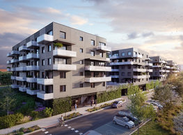
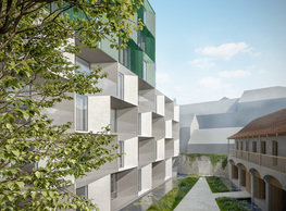
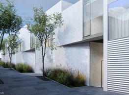
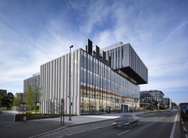
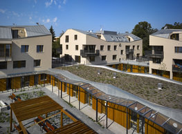
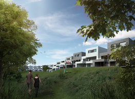
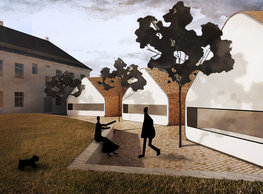
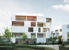
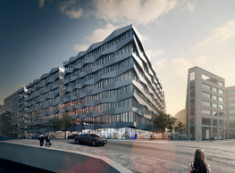
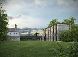
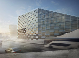
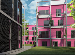
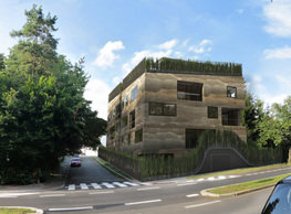
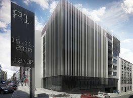
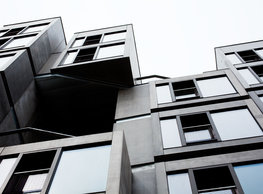
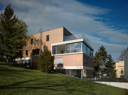
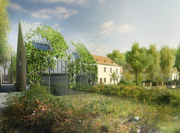
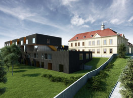
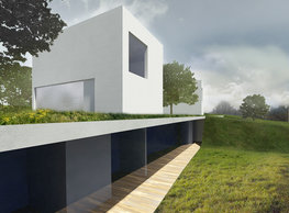
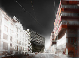
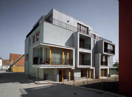
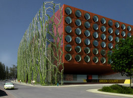
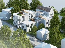
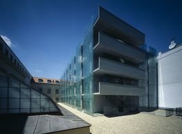
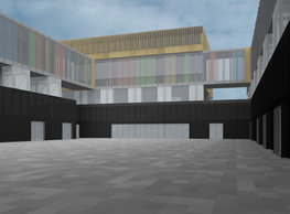
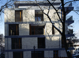
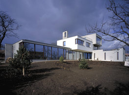
The conceptual base of the volumetric design is the respect to the first local regulation of the built environment and the situation established by the following development in the 1950s. When starting from the preserved maps from the end of the 1930s, one shall find out that the parcels to the north from today’s Jeremenkova are divided into always two lots in the part closer to the river – allocated for a pair of houses: one row facing Jeremenkova and the second one facing Dvorecká. The wedge of land between Jeremenkova and Dvorecká further away from the river is narrower and thus the first regulation situated only detached houses occupying the entire depth of the site here. The land in question is situated on the very border between these two types of original zoning regulation. We borrow the ´semi-detachedness´ of lots west from our lot dating from the pre-war regulation. Thus, we work with a virtual division in two buildings separated by a deep cleavage. By contrast, our volume acknowledges the later added buildings from the second half of the 1950s by the number of stories and the overall ratio of the mass to the land. Dimensioning of the building’s mass and its proportions are closely linked to the qualities of the surroundings. We do not design the house to a place where the original quality that cannot be missed out are views out. On the contrary – the surroundings intrude into the developed site much more than good regarding the requested capacity. That is why we deliberately did not use extensive glazing to kilometres of balconies. Quite the opposite, we decided for a rather introvert house – opening inwards, that is to the amply dimensioned loggias. In our opinion, the quality of housing will not suffer any harm this way – on the contrary, it can become a very comfortable and intimate. The house will this way get an expression of a firm, solid mass. On the other hand, this links to its overall volume – the mass gains another dimension by sliding the exterior living areas inside it as compared with a building of the same interior areas and jutting balconies, for example. We are aware of it and believe that this is a correct solution in the context of this place. The concept of the exterior materialisation of the structure and surfaces stems very tightly and inseparable from the genesis of the volumetric design. The visual inspiration for the material and formal appearance of the building is a metaphor of shaping the site in its current condition. At present, the same as for tens of years in the past, the site is a forgotten garden behind a wire fence. An uncontrolled explosion of vegetation rules this place scattered with remnants of farming and gardening activities here and there – the entire lot is a virtual dense green brush. Everybody in its surroundings has got used to it. The green is a thick barrier here, and a rather natural part of life here, though. We are in a residential neighbourhood of detached houses surrounded by private or semi-public green areas. We are working with a transferred principle of a green carpet on the terrain – lifting, cutting and extruding it in the form of a virtual sod, a cut through the soil with all its layers, and stones and holes they left. We strictly distinguish between the principle of rough, layered mass of colours and the structure of the original soil stratum on the one side, and the surface vegetation on the other side – as an analogy to the currently overgrown state of the site. We interpret this vegetation reduced to a green screen covering the front gardens’ area on the ground; on the parapet where it repeats, it covers the independently looking body of the top story that seems as if it landed on the green surface from the air. This bordering green layer is reinforced by straws of steel bars – in the form of vertical trellises. By planting continuous perimeter planters with species of different type and intensity, a layer of green of variable permeability and concentration will be established on the roof. Where screening will be necessary, greenery will close the space; where views will be needed, it will step aside. The main building’s mass is perforated in two ways: by the loggia openings and by windows flush with the envelope’s surface. Loggia openings reach deeper in the volume contrasting with windows. The character of their railing is as immaterialized as possible – a subtle cable stringing. The crucial element for the expression of the building is the cast envelope. It is a cast in-situ wall from lightweight thermally insulated architectural concrete. It is cast in layers of different colours and grains of aggregate to create a pattern evoking sedimented soil. It is not a sandwiched structure, but a massive wall with adequate parameters of thermal insulation. The greater part of internal loggia facades is fully glazed; we also reckon with mostly glazed façade for the penthouses. The organisation of floor layouts builds on the set-up depth that allows distributing dimensioned rooms sufficiently along the entire perimeter. The single-flight staircase that gets in the centre of the layout above the ground becomes part of the corridor serving the flats. The vertical circulation area must be daylighted and naturally ventilated. We arrange this by inserting a cleavage between the two cubes. Therefore, daylight can get in the corridor from the west entry side and/or from the east through the lift shaft. The selected system can then efficiently and unrestrictedly work with the size of flats, if necessary; flats can be divided/merged. Our design emphasises that each flat has an exterior living area. It is achieved in the form of an entrance to a private front garden and, in most cases, like deep loggias recessed inside, or large roof terraces.
portfolio
![]()
monastery of st. gabriel
![]()
nová zbrojovka block g
![]()
nad krocínkou a
![]()
nad krocínkou b
![]()
dobřichovice farmstead
![]()
nymburk train station
![]()
stará boleslav primary school
![]()
holečkova 26 residence
![]()
komořany elementary school
![]()
kindergarten jeseniova
![]()
nová elektra residence
![]()
filadelfie bldg. – the new reception
![]()
písnice elementary school
![]()
bytové domy vítězná/újezd
![]()
afi vokovice
![]()
showroom elite bath/bulthaup sk
![]()
port 7
![]()
main point pankrác
![]()
oktáva houses
![]()
lesy čr headquarters
![]()
royal tomb
![]()
the blox
![]()
dob centre in dobřichovice
![]()
contemporary glass muzeum
![]()
pod hády brno
![]()
elite bath showroom karlín
![]()
communal flats in dolní břežany
![]()
šantovka residence
![]()
open gate II
![]()
ružinov office building
![]()
dlouhá palace
![]()
vinohradská 8
![]()
masarykovo railway station
![]()
retail and office development
![]()
jindřišská 16
![]()
jungmannova 15
![]()
regina hradec králové
![]()
chateau dolní břežany
![]()
the metropole hotel in mariánské lázně (marienbad)
![]()
waltrovka
![]()
square mechanica
![]()
porto mercandini
![]()
plzeňská 18
![]()
vrchlického residence
![]()
karlín railway
![]()
science research centre
![]()
sněžka apartment house
![]()
novomlýnská brána
![]()
jeremenkova residence
![]()
main point karlin
![]()
flat b3 prague
![]()
štěpánská 47
![]()
tenement house with a gym
![]()
švédská residence
![]()
hendlův dvůr
![]()
klamovka residential complex
![]()
botanica vidoule phase 6
![]()
footbridge in bb centre
![]()
perníkářka manor
![]()
municipal interventions prague 2010
![]()
černá louka ostrava
![]()
evropa hotel
![]()
bb centrum filadelfie
![]()
family houses in radotín
![]()
cherubín II
![]()
fc bohemians praha 1905
![]()
ostrolovský újezd chateau
![]()
zlín cultural centre
![]()
znojemská hospice
![]()
pilsner urquell
![]()
st. wenceslas exposition
![]()
institute of noblewomen
![]()
karlov office building
![]()
cherub I
![]()
pařížská 9
![]()
jinonice villa park
![]()
petynka hotel
![]()
sanopz residential complex
![]()
viktoria center pankrác
![]()
hotel crystal palace
![]()
invalidovna offices
![]()
performing arts center seoul
![]()
boscolo carlo IV hotel
![]()
toner recycling company building
![]()
the story of prague castle
![]()
umprum in prague-ďáblice
![]()
mrázovka apartment villa
![]()
school gym in prague-troja
![]()
roma hotel
![]()
euro palace
![]()
ten centuries of architecture
![]()
villa třešňovka
![]()
velká skála
![]()
sternberg palace prague castle
![]()
st. nicholas church in čečovice
![]()
olga and václav havel's villa
![]()
tierpark langenberg
![]()
a church in neratovice
![]()
school centre interlaken
![]()
forestry school in lyss
![]()
villa dobeška
![]()
tuscany in maps


