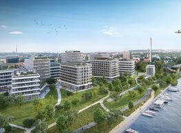
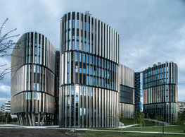
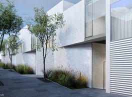
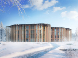
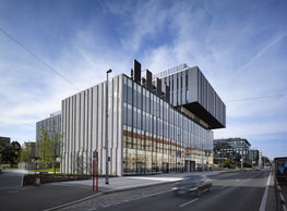
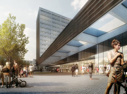
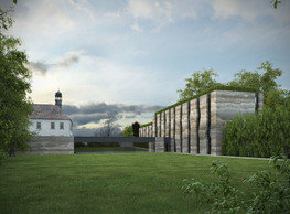
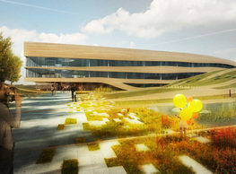
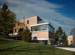
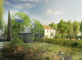
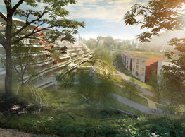
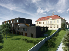
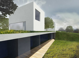
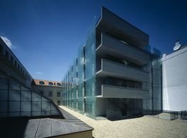
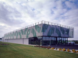
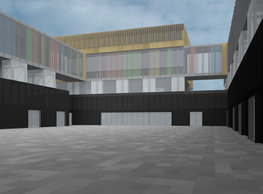
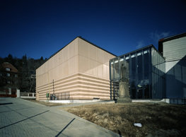
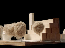
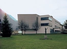
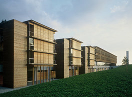
The conceptual base of the volumetric design is working with the site – the grade. We are in a location where developing any context is impossible the way it would be in some, for instance, urbanised environment. The grade of the flood plain turns out to be our conceptual matter – a green layer on a base of a formation of local settled clays. By adopting this attitude, we come close to nature. That is the same way as this scientific institution, for which the building is developed, occupies itself in nature and exploration of its patterns. Thus, we transform the whole complex of new buildings in a system of one-way oriented terrain belts of various widths we work with in the form of landscaping. By playing with heights and by waving this sliced landscape, we are getting the form washing away differences between the buildings and nature – the surrounding terrain. We intentionally suppress the borderline between the landscape and the buildings. Everything has a unified top surface. By tiny differences in modulation of wavy belts, strengthening cutting edges, and unifying of the surface of vertical separating structures between them, we try to achieve the maximally natural and at the same time visible separation – stripping. Playing with the heights of the strips´ surfaces will allow us, among others, to work with water sheets in each depression. They can at the same time serve as a reservoir for rainwater harvesting. Collected water can then return to the ecosystem in the form of irrigation, for instance. Thus, the access road to the north façade and the bordering tree-lined avenue remains preserved; the raised counter slope on the east side of the site that (be a VIP car parking garage under it or not) positively delimits the area in front of the building to the surroundings. The concept of external materialisation of the structure and surfaces results very tightly and inseparably from the genesis of the volumetric design. The metaphor of sequential, deep slicing of the site and the following work with raising and waving of these belts including acknowledging of all ´settled´ subgrade layers is visual inspiration for the material and formal appearance of the building. One of this way raised slices is the lab building. The main building fully presents its 3-4 aboveground stories, while other buildings are more-or-less sunken below the grade and do not show up too much. Solid parts of its envelope (plinths, spandrels above windows, parapet) are thus designed as a clear vertical cut through the grade, and they consist of a recognised irregularly horizontally layered skin (most likely concrete- or terrazzo-based). Horizontal cuts in this mass establish randomly cut belts of glazing. A subtly glazed layer of common areas, radically different in shape, is ´slipped´ below the mass in the entrance area.
portfolio
![]()
monastery of st. gabriel
![]()
nová zbrojovka block g
![]()
nad krocínkou a
![]()
nad krocínkou b
![]()
dobřichovice farmstead
![]()
nymburk train station
![]()
stará boleslav primary school
![]()
holečkova 26 residence
![]()
komořany elementary school
![]()
kindergarten jeseniova
![]()
nová elektra residence
![]()
filadelfie bldg. – the new reception
![]()
písnice elementary school
![]()
bytové domy vítězná/újezd
![]()
afi vokovice
![]()
showroom elite bath/bulthaup sk
![]()
port 7
![]()
main point pankrác
![]()
oktáva houses
![]()
lesy čr headquarters
![]()
royal tomb
![]()
the blox
![]()
dob centre in dobřichovice
![]()
contemporary glass muzeum
![]()
pod hády brno
![]()
elite bath showroom karlín
![]()
communal flats in dolní břežany
![]()
šantovka residence
![]()
open gate II
![]()
ružinov office building
![]()
dlouhá palace
![]()
vinohradská 8
![]()
masarykovo railway station
![]()
retail and office development
![]()
jindřišská 16
![]()
jungmannova 15
![]()
regina hradec králové
![]()
chateau dolní břežany
![]()
the metropole hotel in mariánské lázně (marienbad)
![]()
waltrovka
![]()
square mechanica
![]()
porto mercandini
![]()
plzeňská 18
![]()
vrchlického residence
![]()
karlín railway
![]()
science research centre
![]()
sněžka apartment house
![]()
novomlýnská brána
![]()
jeremenkova residence
![]()
main point karlin
![]()
flat b3 prague
![]()
štěpánská 47
![]()
tenement house with a gym
![]()
švédská residence
![]()
hendlův dvůr
![]()
klamovka residential complex
![]()
botanica vidoule phase 6
![]()
footbridge in bb centre
![]()
perníkářka manor
![]()
municipal interventions prague 2010
![]()
černá louka ostrava
![]()
evropa hotel
![]()
bb centrum filadelfie
![]()
family houses in radotín
![]()
cherubín II
![]()
fc bohemians praha 1905
![]()
ostrolovský újezd chateau
![]()
zlín cultural centre
![]()
znojemská hospice
![]()
pilsner urquell
![]()
st. wenceslas exposition
![]()
institute of noblewomen
![]()
karlov office building
![]()
cherub I
![]()
pařížská 9
![]()
jinonice villa park
![]()
petynka hotel
![]()
sanopz residential complex
![]()
viktoria center pankrác
![]()
hotel crystal palace
![]()
invalidovna offices
![]()
performing arts center seoul
![]()
boscolo carlo IV hotel
![]()
toner recycling company building
![]()
the story of prague castle
![]()
umprum in prague-ďáblice
![]()
mrázovka apartment villa
![]()
school gym in prague-troja
![]()
roma hotel
![]()
euro palace
![]()
ten centuries of architecture
![]()
villa třešňovka
![]()
velká skála
![]()
sternberg palace prague castle
![]()
st. nicholas church in čečovice
![]()
olga and václav havel's villa
![]()
tierpark langenberg
![]()
a church in neratovice
![]()
school centre interlaken
![]()
forestry school in lyss
![]()
villa dobeška
![]()
tuscany in maps


